So, lets jump right into it. I like the progression of this course in terms of the things you learn in every module – it’s still simple and basic compared to what Flutter or any mob dev platform can do, but from a beginner’s perspective, there’s many new things you get to learn in this course.
Note: this is continuation from Flutter bootcamp course by Angela Yu.
Now, the BMI Calculator – pretty simple and straightforward in terms of the functionality. You provide certain parameters like height, weight, age etc and it calculates your BMI based on a formula, and displays the result. There will be two screens (ikr!), and this is how they’ll look like.
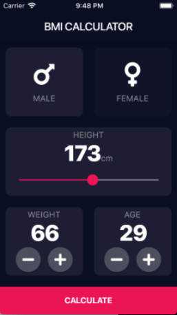

Lets analyse the UI. Page1:
- is made of 5 cards which has it’s own icons and other widgets within it. Basically this is a placeholder customized to have it’s own children, color and other properties. So, we’d be creating a general template windget (like a container or expanded), and we’ll be calling it ReusableCard.
- The first two reusable cards have similar children. So, we create a child called IconContent. This widget will have two children passed on as parameters – an icon (male/female icon) and a text(‘male’/’female’)
- The 3rd reusable card will have 3 children – a text(‘height’), text(the numerical value of height) and a Slider – whose value will be the numerical height value in the text above.
- The 4th and the 5th reusable card will have 3 childrens – a text(weight/age), text(numerical value of weight/age), and a row containing two children. These two childrens will be a custom widget created based on the RawMaterialButton class. You’d pass two parameters – an icon, and an onpress method.
- Lastly, it will be a flatbutton with a text – ‘calculate’. this takes the values recorded so far and does the math. This button is also responsible for our page navigation.
Page2:
- Has a column with 3 children – first one displays the text ‘Your Result’, second one has a ReusableCard child, which has 3 children – a text(displays an overview), text(numerical value of calculated bmi), and a text(a brief description of the result), and then third child – the recalculate button which takes you back to page1.
The interesting part of this app is that we get to create custom widget which just opens up the doors for many possibilities. We’ll also be using a dart file to store all the constant values – like color, text style etc.
Okay, lets try the outline now.
- Create custom widgets – ReusableCard, IconContent, RoundIconButton, CalculateButton
- Import the assets
- Complete the UI layout
- Implement functionality
Create custom widgets
1. ReusableCard
So, the easiest way is to write the code first and then you can extract it out as a widget using your editor which will then seperate that code as a class – and then you can move it to another dart file to clean up things. The finished code for the ReusableCard will look like below,
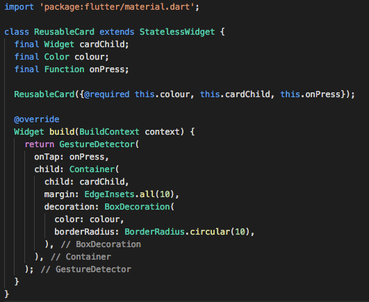
Points to note:
- going to be a stateless widget, as there’s no need to update the UI/state
- has 3 properties – a widget cardChild (could be any widget), Color, and a function onPress. Only the color property is marked as mandatory (@required) when initialising
- the build widget returns a GestureDetector since we need the card to be interactive = change color on tap to show active/inactive
- GestureDectector assigns the onPress property of the class to onTap property of its own. Creates a Container as it’s child to hold it’s own child – which could be any widget = cardChild. The cardChild widget then has the Color property of the class assigned to the color property of itself.
2. IconContent
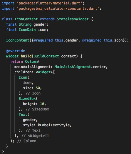
Points to note:
- is a stateless widget since UI/state doesn’t need to change
- two properties for the class – string gender, and an IconData called icon.
- marking both as required while initialising
- the arrangement is basically within a column with 3 children – icon, a spacer (SizedBox), and a Text. — pretty straightforward.
- Note that we have also used the text style from the Constants.dart file which stores all the constants used throughout the project. Contents of the constants page will be shown later.
3. RoundIconButton
since, a flatbutton doesn’t really server our purpose here, we decided to create our own custom button based on the RawMaterialButton class.
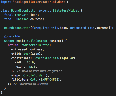
Points to note:
- extends a stateless widget since ui/state isn’t changing
- class has two properties – an IconData called icon, and a function called onPress both of which are marked as required during intialisation.
- build returns a RawMaterialButton which has a child – this is where icon is passed, and a function onPresssed – this is where onPress is passed to.
4. Calculate Button
The calculate button is also created as a widget because its the same as Recalculate button (with a different text). 
Points to note:
- extends a stateless widget since no update to ui/state
- two properties for the class – a function onTap and a string buttonTitle – and both are marked as required during initialisation
- build widget returns a GestureDetector – which has a Container child – which has a Text child, and this is where the buttonTitle is passed to. onTap event of the GestureDetector gets assigned the onTap property of the class.
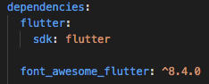
Import the assets
The asset we’ll be using in this app is a package of icons. This one’s pretty good actually with a wide range of really cool icons. You just need to add the dependency to the pubspec.yaml file, and then import it to your dart files.

Complete the UI Layout
1. Input Page (the first page)
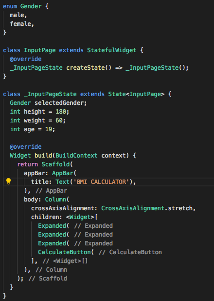
Points to note:
- UI is pretty straightforward. The entire UI is a column which has 4 children – 3xExpanded, 1xButton.
- we have created an enumeration called Gender, values being male and female. This will be used later to identify which of the cards – male or female – has been pressed, to update its color. There’s another Gender type variable called selectedGender. This will be useful in deciding the user tapped card.
- There’s also few other variables which is used to update the numerical values for height, weight and age.
2. ReusableCard code
The code for one of the reusablecard looks like below;
Points to note:
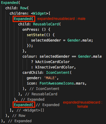
- basically an Expanded widget which has a ReusableCard as its child
- cardChild calls the IconContent widget where you pass a string ‘MALE’/’FEMALE’ and the corresponding icon (FontAwesomeIcon)
- colour property of the ReusableCard checks the value of selectedGender before assigning it a color (depending on active or not).
- Tapping on the male card on ui activates it, multiple tapping on it doesn’t inactive it – you can only activate cards, not inactivate them.
- Basically the UI of these two widgets (male and female) need to change, and the only thing that changes is the color to make it look like its active or not. This is determined by the selectedGender property. We call the setState() function and inside it, we assign the selectedGender to the button that was pressed (male/female). Now everytime setState is called and the canvas is repainted, it will check the value of selectedGender and then update the colour property accordingly.
3. Slider
The code of the 3rd ReusableCard is below. The main highlight is the slider tool used here

Points to note:
- an expanded widget as parent, and column as child. This column has 3 children – a text, a row(containing two texts), and a slider
- minimum and maximum values of the slider are set to 120.0 and 220.0
- variable height is assigned to value property of the slider (as a double)
- we call the setState() method inside the onChanged() of the slider. When the slider is dragged left or right, it constantly keeps on getting a new value, this new value is rounded and assigned to variable height. Which means, everytime the slider is dragged – new value is assigned to height variable, and setState repaints the canvas and updates the places the variable height is used, which is the numerical value, and the value(position) of the slider knob itself.
4. RoundIconButton
The UI layout looks like below

But this is the interesting part here – the RoundIconButton widget

Points to note:
- RoundIconButton gets an icon assigned to its icon property. You can see one being assigned for minus and one for plus.
- The onPress calls the setState() which simply increments or decrements variable – in this case weight (depends on which button is pressed). So, everytime the button is pressed, setState() repaints the canvas updating the places where the corresponding variable (weight) in this case is used.
5. CalculateButton
So the last part of the UI is our custom widget CalculateButton. The code below;
Points to note:
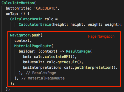
- Since this button is on the first page, the text we’ll be passing to buttonTitle would be ‘CALCULATE’
- the onTap() event is where things happen in terms of functionality. There’s two things we have to achieve – calculate the bmi, and navigate to the result page. All of the functionality is written inside a class called CalculatorBrain (which will be explained later). To access the properties and methods of the class, we create an object called calc.
- the initialiser takes in two arguments which are the properties of the class – height and weight, and we use those properties for the functions – calculateBMI(), getResult(), and getInterpretation() – which as it sounds calculates the BMI, gets a BMI result as a text, and gets an interpretation of the result. All these functions return a string.
- Navigator.push method is when you want to switch to another page – basically its like loading a page on top of your current page. The page we’re loading here is called ResultsPage.
- ResultsPage takes in three arguments in its initialisation – bmi, bmiResult, bmiInterpretation – which are all properties of ResultsPage of type string.
- So basically, when onTap event happens, BMI results are calculated and passed on to the ResultsPage when its loaded, to be displayed later.
6. ResultsPage (the second page)
The results page code below
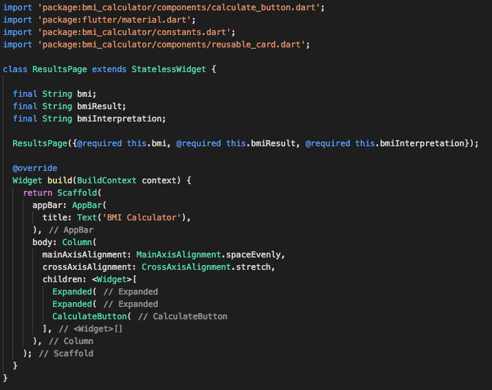
Points to note:
- Extends a stateless widget since no changes to the state/ui
- Three properties as mentioned earlier – bmi, bmiResult, bmiInterpretation. These properties gets assigned with results of BMI calculation as shown earlier, during the initialisation (also they are all marked as required)
- UI is basically a Column with three children – Expanded(has a text as child to display the text ‘Your Result’), Expanded (code below), CalculateButton (code below)
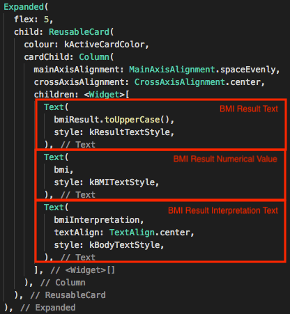
- each Text widget here displays the properties of this class – which got its values on initialisation

- Because it’s on the ResultsPage, the button text (buttonTitle) is going to say ‘RECALCULATE’
- onTap() method pops the page that had been loaded (context = current page/ResultsPage) – which means we are back to the page that was underneath = InputPage
Implement Functionality
So the last part of the code – the brain, this is where the calculations happen. And also the easiest part in this project actually. Code below,
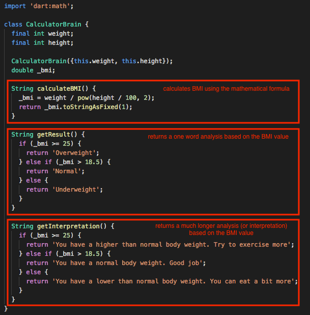
Points to note
- we’d be using certain mathematical functions, so we need to import dart:math
- Two properties, both integers – height, weight – both initialised (not marked as required, but on second thoughts, it had to be)
- Three functions CalculateBMI(), getResult() and getInterpretation() does what it says – pretty straightforward actually. Also marked on the image above.
- _bmi.toStringAsFixed(1) rounds the calculated BMI value to 1 decimal place.
Thats it!
To be updated with the code on git
 The Dumb Coder